Using brolgar to understand Mixed Effects Models
Source:vignettes/mixed-effects-models.Rmd
mixed-effects-models.RmdJust as it is important to explore your data before modelling, it is important to explore your data after you fit a model, and during the modelling process.
Let’s take our wages data
wages
#> # A tsibble: 6,402 x 9 [!]
#> # Key:       id [888]
#>       id ln_wages    xp   ged xp_since_ged black hispanic high_grade
#>    <int>    <dbl> <dbl> <int>        <dbl> <int>    <int>      <int>
#>  1    31     1.49 0.015     1        0.015     0        1          8
#>  2    31     1.43 0.715     1        0.715     0        1          8
#>  3    31     1.47 1.73      1        1.73      0        1          8
#>  4    31     1.75 2.77      1        2.77      0        1          8
#>  5    31     1.93 3.93      1        3.93      0        1          8
#>  6    31     1.71 4.95      1        4.95      0        1          8
#>  7    31     2.09 5.96      1        5.96      0        1          8
#>  8    31     2.13 6.98      1        6.98      0        1          8
#>  9    36     1.98 0.315     1        0.315     0        0          9
#> 10    36     1.80 0.983     1        0.983     0        0          9
#> # ℹ 6,392 more rows
#> # ℹ 1 more variable: unemploy_rate <dbl>
We might explore this by looking at experience against wages, for each individual:
gg_wages_all <-
ggplot(wages,
aes(x = xp,
y = ln_wages,
group = id)) +
geom_line(alpha = 0.25)
gg_wages_all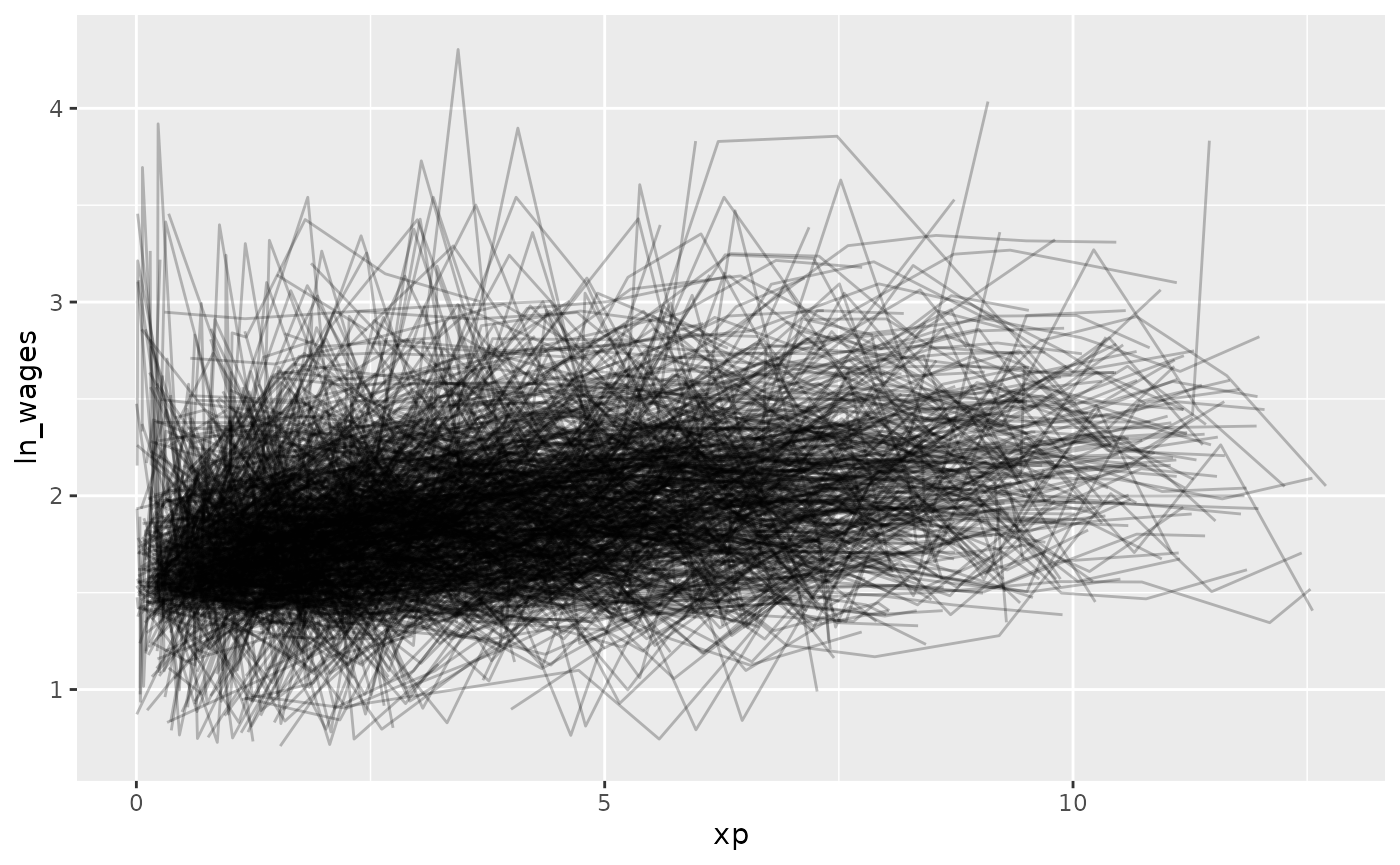 But - Ugh. Spaghetti plot.
Let’s look at a random sample of people using
facet_sample()
gg_wages_all +
  facet_sample()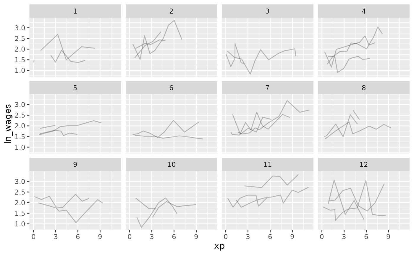
Now let’s look at all of the data, arranging by
unemploy_rate:
gg_wages_all + facet_strata()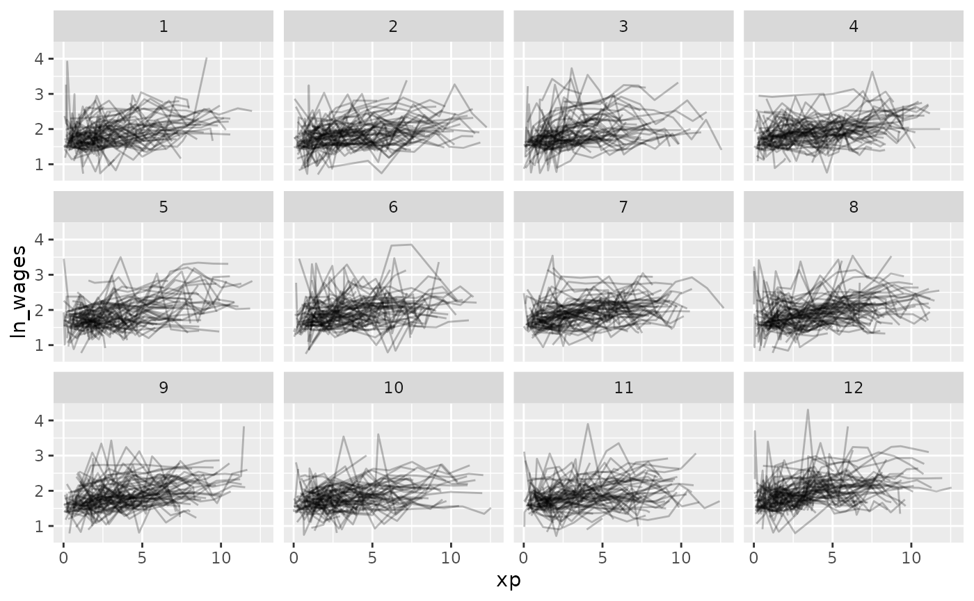
gg_wages_all +
  facet_strata(along = unemploy_rate)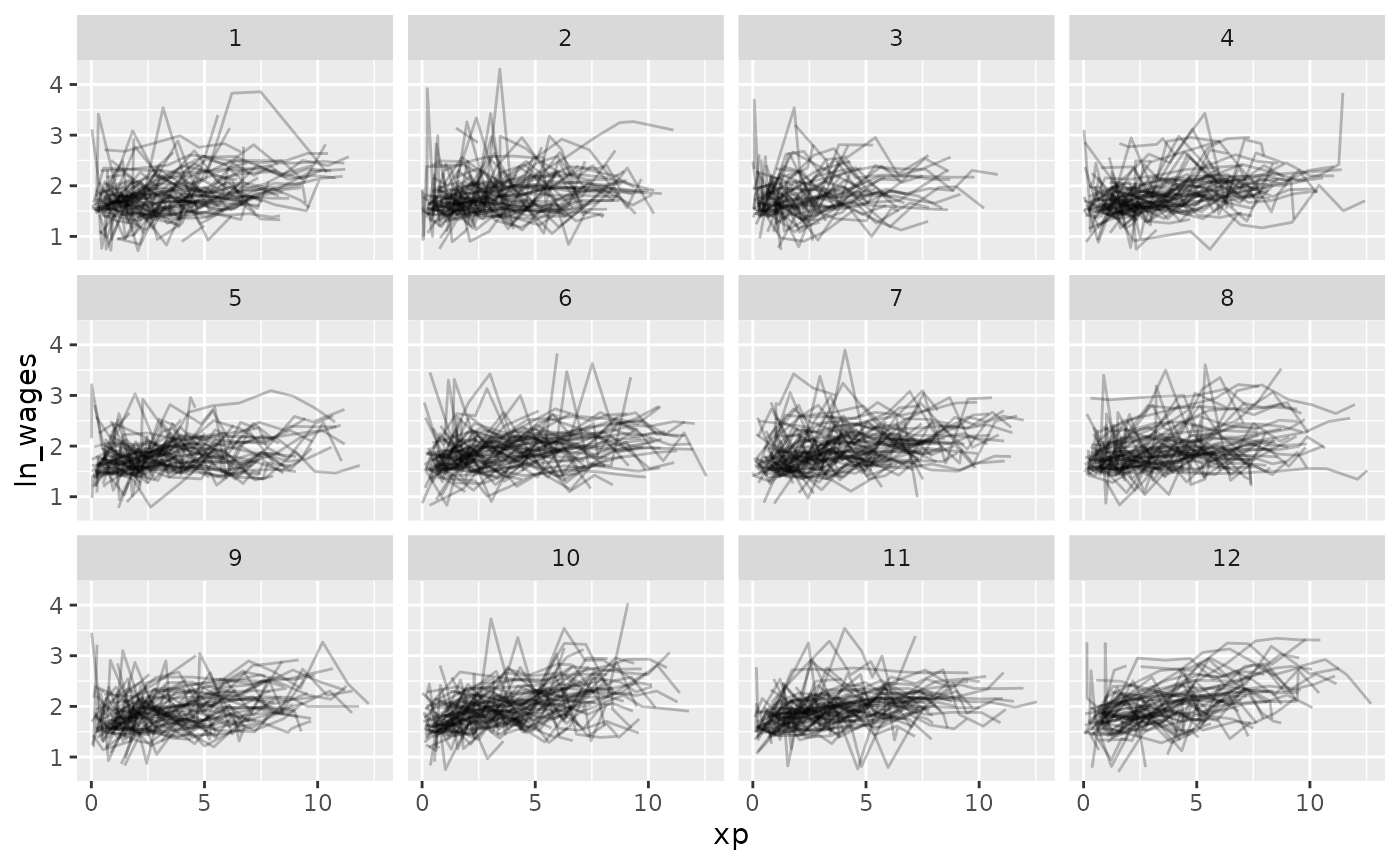
gg_wages_all +
facet_strata(along = xp_since_ged) 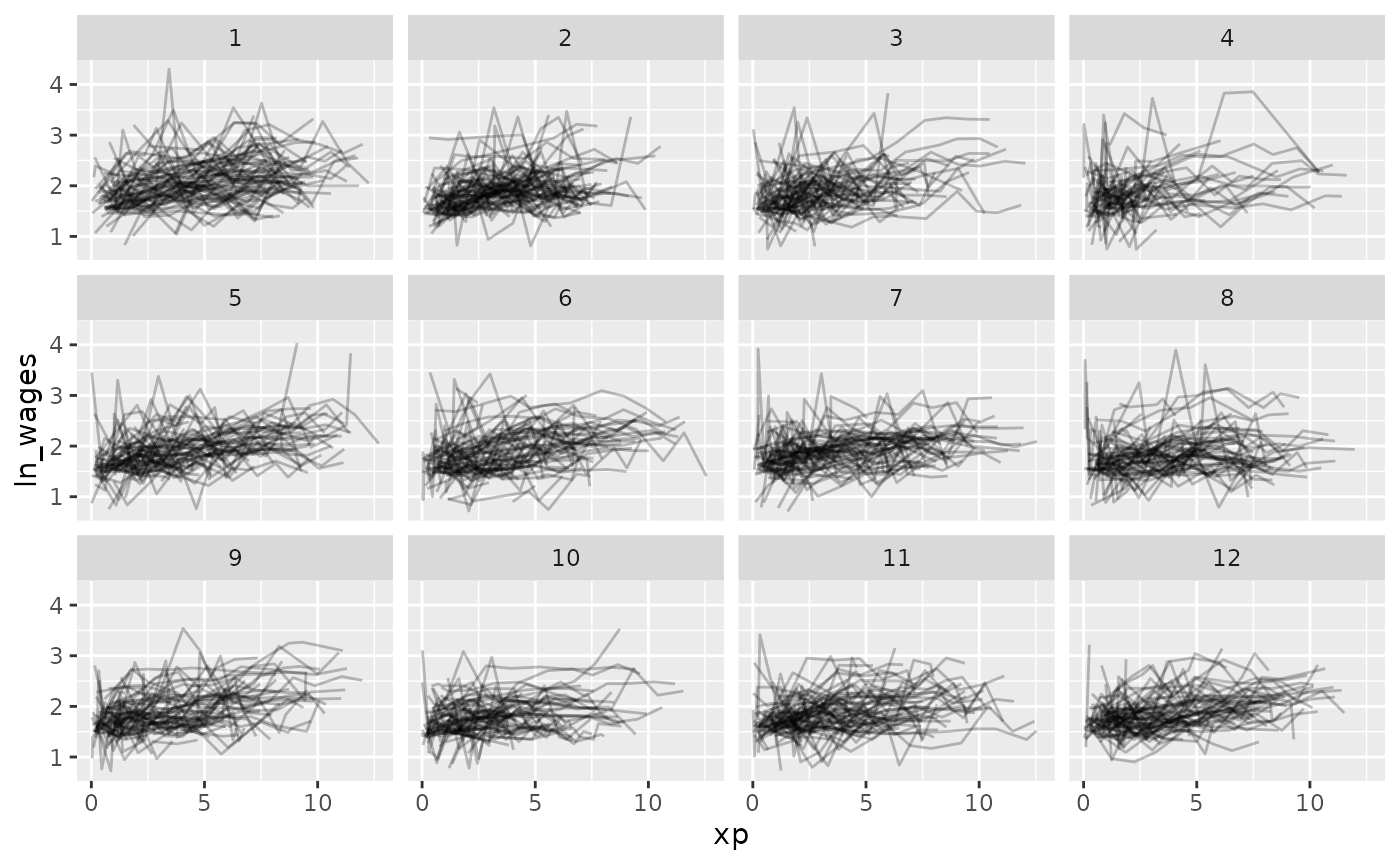
gg_wages_all + facet_wrap(~high_grade)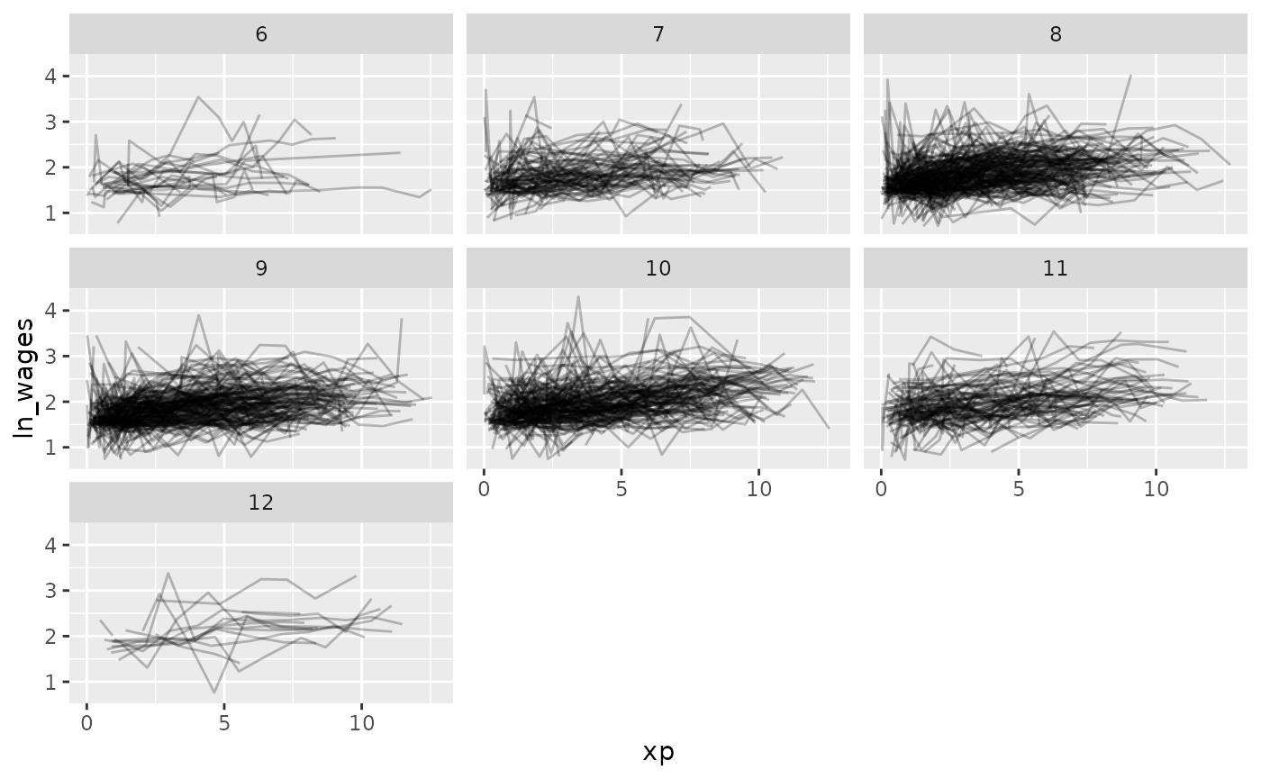
So let’s fit a model where we look at the impact of xp, unemployment rate, and fit an intercept for each individual.
We can use the tools from modelr to add predictions and
residuals to the data
library(modelr)
wages_aug <- wages %>%
  add_predictions(wages_fit_int, var = "pred_int") %>%
  add_residuals(wages_fit_int, var = "res_int")
Now let’s look at the predictions over xp
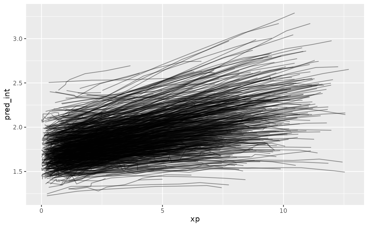
Ugh. Straight spaghetti. Let’s sample that.
ggplot(wages_aug,
       aes(x = xp,
           y = pred_int,
           group = id)) +
  geom_line() +
  facet_sample()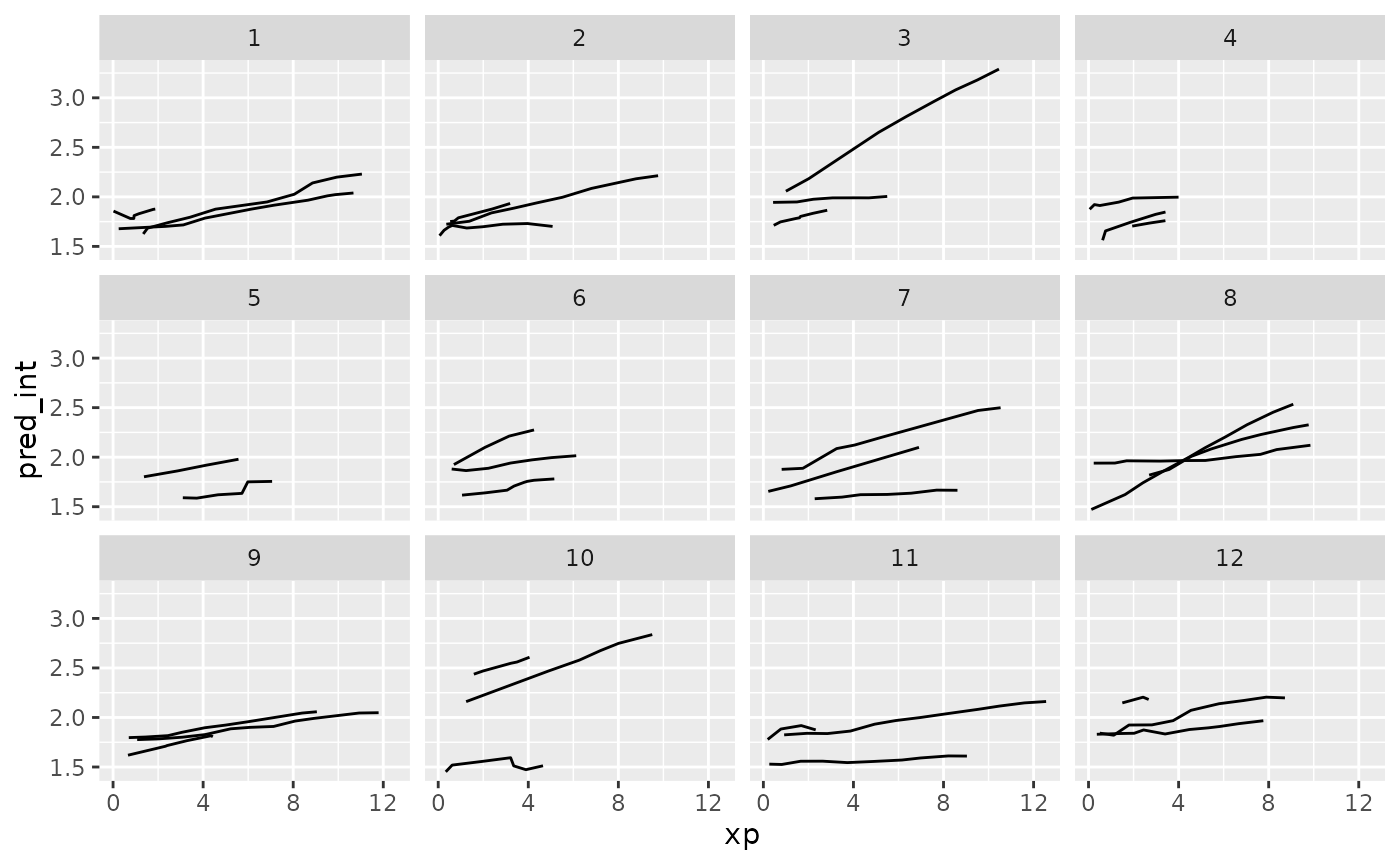
And let’s explore these according to residuals.
ggplot(wages_aug,
       aes(x = xp,
           y = pred_int,
           group = id)) +
  geom_line() +
  facet_strata(along = res_int)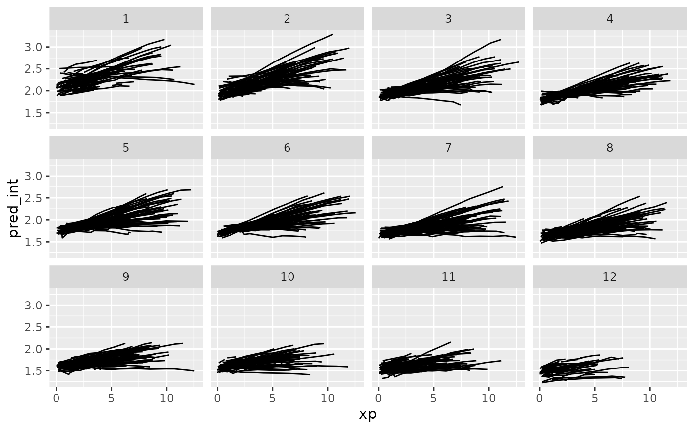
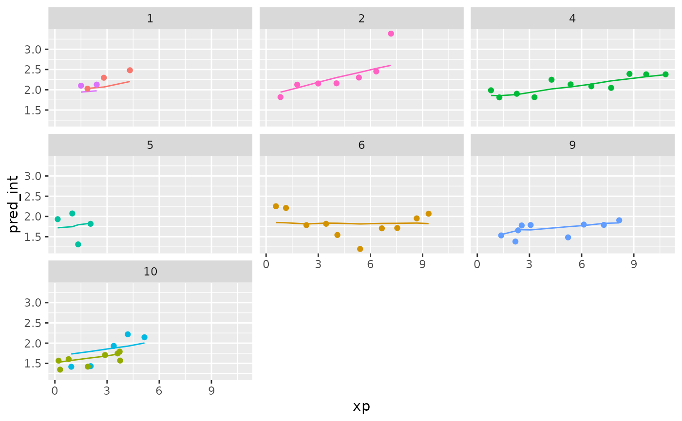
Now let’s add in the data to the predictions.
wages_aug %>%
  sample_n_keys(size = 9) %>%
  ggplot(aes(x = xp,
             y = pred_int,
             group = id,
             colour = factor(id))) +
  geom_line() +
  geom_point(aes(x = xp,
                 y = ln_wages,
                 colour = factor(id))) +
  facet_wrap(~id) +
  theme(legend.position = "none")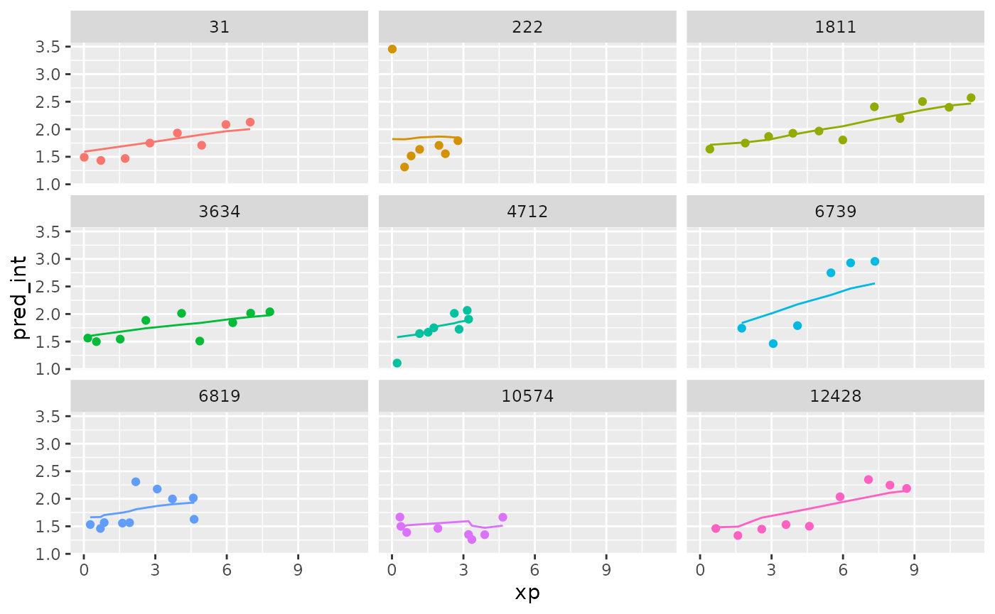
What if we grabbed a sample of those who have the best, middle, and worst residuals? Those who are closest to these values:
summary(wages_aug$res_int)
#>      Min.   1st Qu.    Median      Mean   3rd Qu.      Max.
#> -1.305705 -0.159721 -0.009442  0.000000  0.136405  2.148925
We can use keys_near() to return those specified keys
that are close to these values. Because this is a tsibble
object, we don’t need to specify the key variable here.
wages_aug_near <- wages_aug %>%
  keys_near(var = res_int)

wages_aug_near
#> # A tibble: 6 × 5
#>      id  res_int stat  stat_value  stat_diff
#>   <int>    <dbl> <fct>      <dbl>      <dbl>
#> 1   122 -1.31    min     -1.31    0
#> 2   735  2.15    max      2.15    0
#> 3  2026 -0.00955 med     -0.00944 0.000104
#> 4  3961 -0.00934 med     -0.00944 0.000104
#> 5  5778 -0.160   q_25    -0.160   0.0000108
#> 6  8246  0.136   q_75     0.136   0.00000511
This shows us the keys where we the residuals match closest to the five number summary.
We can plot this data by joining it back to the wages data with predictions, to see what the spread of predictions is like.
library(dplyr)

wages_aug_near_full <- left_join(wages_aug_near,
                                 wages_aug,
                                 by = "id")

gg_wages_near <-
  ggplot(wages_aug_near_full,
       aes(x = xp,
           y = pred_int,
           group = id,
           colour = stat)) +
  geom_line() +
  geom_point(aes(y = ln_wages))

gg_wages_near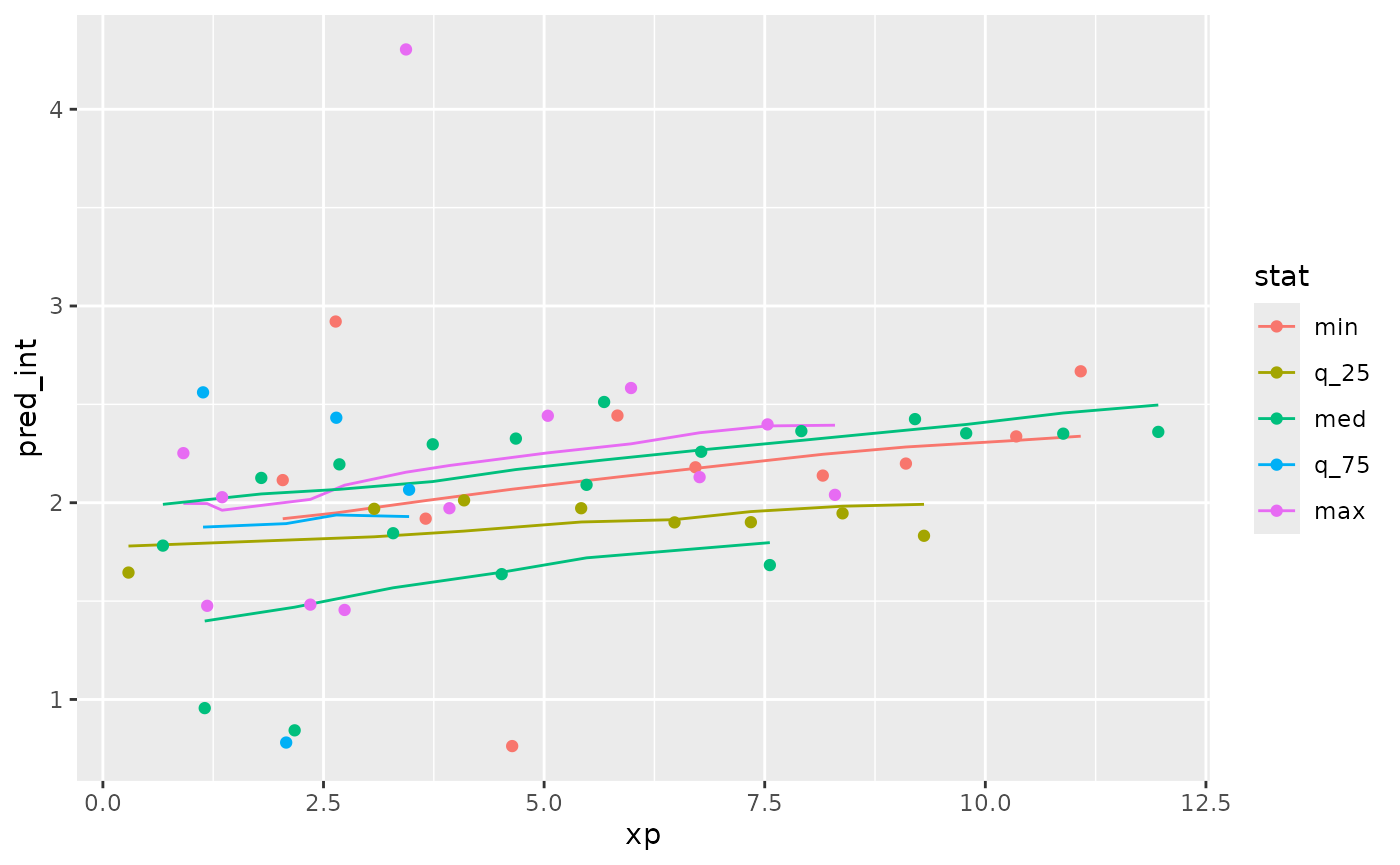
gg_wages_near +
 facet_wrap(~stat) +
  theme(legend.position = "none")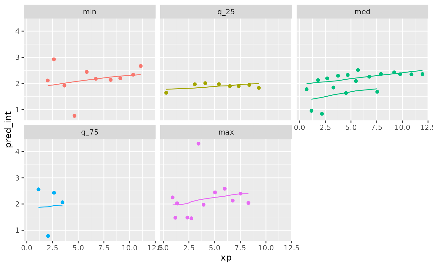
We can also use stratify_along to group by the worst
fits
wages_aug %>%
  stratify_keys(n_strata = 12,
                along = res_int) %>%
  sample_n_keys(size = 9) %>%
  ggplot(aes(x = xp,
             y = pred_int,
             group = id,
             colour = factor(id))) +
  geom_line() +
  geom_point(aes(x = xp,
                 y = ln_wages,
                 colour = factor(id))) +
  facet_wrap(~.strata) +
  theme(legend.position = "none")