To look at as much of the raw data as possible, it can be helpful to
stratify the data into groups for plotting. You can stratify the
keys using the stratify_keys() function, which adds the column,
.strata. This allows the user to create facetted plots showing a more
of the raw data.
Arguments
- .data
data.frame to explore
- n_strata
number of groups to create
- along
variable to stratify along. This groups by each
keyand then takes a summary statistic (by default, the mean). It then arranges by the mean value for eachkeyand assigns then_stratagroups.- fun
summary function. Default is mean.
- ...
extra arguments
Examples
library(ggplot2)
library(brolgar)
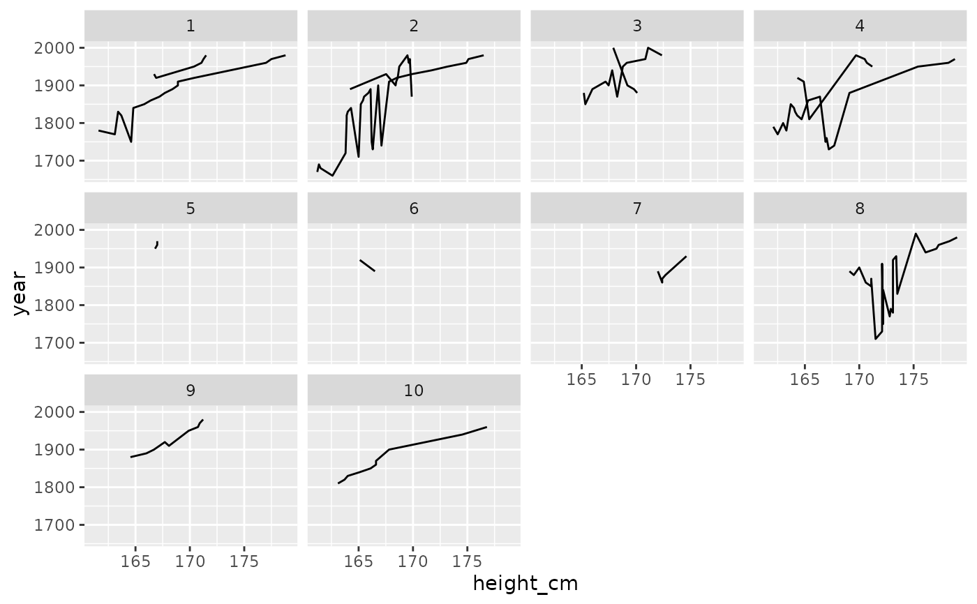
heights %>%
sample_frac_keys(size = 0.1) %>%
stratify_keys(10) %>%
ggplot(aes(x = height_cm,
y = year,
group = country)) +
geom_line() +
facet_wrap(~.strata)
 # now facet along some feature
library(dplyr)
heights %>%
key_slope(height_cm ~ year) %>%
right_join(heights, ., by = "country") %>%
stratify_keys(n_strata = 12,
along = .slope_year,
fun = median) %>%
ggplot(aes(x = year,
y = height_cm,
group = country)) +
geom_line() +
facet_wrap(~.strata)
# now facet along some feature
library(dplyr)
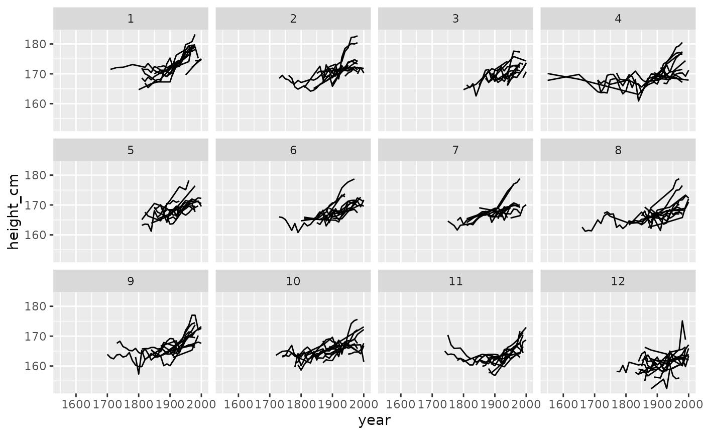
heights %>%
key_slope(height_cm ~ year) %>%
right_join(heights, ., by = "country") %>%
stratify_keys(n_strata = 12,
along = .slope_year,
fun = median) %>%
ggplot(aes(x = year,
y = height_cm,
group = country)) +
geom_line() +
facet_wrap(~.strata)
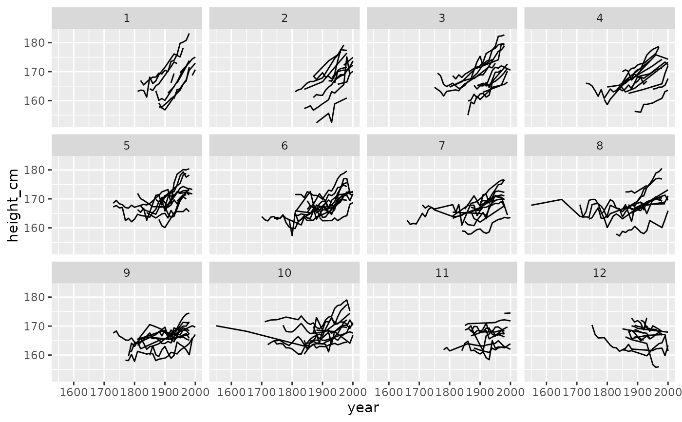 heights %>%
stratify_keys(n_strata = 12,
along = height_cm) %>%
ggplot(aes(x = year,
y = height_cm,
group = country)) +
geom_line() +
facet_wrap(~.strata)
heights %>%
stratify_keys(n_strata = 12,
along = height_cm) %>%
ggplot(aes(x = year,
y = height_cm,
group = country)) +
geom_line() +
facet_wrap(~.strata)